Length / 3 minutes
At Tailor, our skincare is concise and simple, created with intention – and this goes beyond just our formulas. Some may say we are trend setters for the vibrant neon and pastel colour palette in the skincare packaging space. Because, when we originally made this switch from rose gold foils and white, coloured packaging for individual SKU's was not often seen on shelves. Our neon and pastel palette tells a story as each individual product has been carefully selected to reflect the formulations inside. Without further ado, let’s dive into the thought process behind our neon pastel Tailor palette.
Tailor Blue
 |
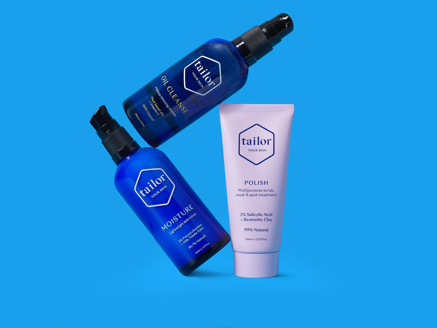
When Tailor Skincare launched over 12 years ago, we were founded on the principle of being eco-conscious—at a time when this term was rarely associated with beauty brands. Today, sustainability is a standard expectation for customers, a shift we fully support. From the start, we were committed to choosing the most environmentally friendly packaging, which led us to glass for its easy kerbside recyclability in New Zealand. During our research, we found that most skincare brands using glass opted for either amber or clear glass. Wanting to stand out, we chose blue glass, sourced from a Wellington-based supplier who imported it from Germany. This distinct blue glass has since become iconic for our brand, now affectionately known as “Tailor Blue.” It remains a core part of our identity and has endured through every packaging evolution over the past 12 years, cementing itself as our primary brand colour. |

Product range
 |
Oil Cleanse [Neon yellow]: It’s simple – we chose Oil Cleanse to be neon yellow because the oil itself is neon yellow. We kept it natural, vibrant, and true to its roots. |
 |
Gel Cleanse: [Neon teal] It needed a colour that reflected how it feels on the skin – cool, calm, fresh, and fun. Plus, it looks cute next to Polish in the shower. |
 |
Polish: [Neon purple] One of our OG’s, we knew we needed a purple colour. With P for Polish and P for Purple, it was a perfect match. Plus, the purple hue complements the clay mask formula and looks great next to the neon yellow of Oil Cleanse. |
 |
Elevate: [Neon orange] This fun and bright yellow formulation deserved a colour to match this description, so of course, we went with a neon orange, you know that sunset, warm orange colour that gives our mood a ‘boost’ - naturally made sense with this being a skincare ‘boosting’ mask. |
 |
Renew: [Neon peach] It’s formula is a soft, dusty peach colour, so immediately knew this had to translate to its packaging, which led us to neon peach. But, let’s be real, it was our favourite colour in the pantone book and Renew is our favourite (shhhh... don’t tell the others)! |
 |
Hydrate: [Neon turquoise] What comes to mind when you think of hydration? Crystal-clear aqua waters we all know and love, of course! Naturally, Hydrate’s colour is a beautiful reflection of those refreshing hues. |
 |
Gold Dust: [Neon pastel yellow] With "Gold" in the name, we knew we had to keep that going! Originally, Gold Dust was delivered in a metallic foil and white packaging, but as we transitioned to our neon and pastel palette - we fell in love with the neon pastel yellow and knew it was the perfect equivalent. |
 |
Moisture: [Neon pastel blue] As our day moisturiser, it was a no-brainer for this to reflect those light blue skies (which our Aussie Tailor’s would know more about). Enter, our pastel baby blue - crisp and light. |
 |
Restore: [Neon blue] Since Restore is our night-time moisturiser, we knew it had to align with our existing day moisturiser, but a deeper, richer blue – like the sky at night, but it had to be bright and fun too. Plus, its hero ingredient, NZ seaweed, is perfectly paired with a bright, ocean-inspired shade. |
 |
Awaken: [Neon pastel nude] Our brightening eye cream, commonly known as our morning pick me up, had to reflect exactly this. Plus, it’s formulated to replace a concealer, for a more natural look, so just like the product itself, it’s a bright, natural nude colour. |
 |
Illume: [Neon green] The green hue of our NZ sourced Hemp seed oil inspired us, which compared to the yellow oils that come from off-shore. And, it’s a youth elixir, with potion vibes, so we thought this witchy green complemented it well. |
 |
Towel: [Neon pastel pink] We had to have a millennial pink moment in our range. Plus, this was a complimentary product to our Oil Cleanse and Polish, so we thought what would make a cute match for our neon yellow oil and neon purple? Pink, of course! We had to ensure it would make for an aesthetic shelf. |
 |
Mini Kit: [Pastel blue] We wanted to tie together the whole trio of Mini Oil Cleanse (neon yellow), Mini Polish (neon purple), and Mini Moisture (pastel blue). We found our neon yellow a bit tricky to mix and match, so we opted for a periwinkle blue, striking the perfect balance between neon purple and neon pastel blue. |
A bit of behind the scenes info for you, on our *true* meaning behind each individual product and it’s colour match. As you can see, our neon & pastel colour palette has been chosen with purpose, creating a vibrant palette that stands out on shelf. I know it’s hard to play favourites with our range, what’s your favourite colour?
P.S. Because, we never want to run out of neon and pastel colour’s for future products, we’d love to hear your colour suggestions…please let us know via info@tailorskin.co!
Love,
Tailor